Compound interest has been described as the eight wonder of the world. I have passion for finance and investing, and I am digging deep into the Pandas library these days. That presented a good opportunity to use Pandas-enabled visualizataion to demonstrate the power of compounding! A common investment advice is to start early, and to stay invested over a long period of time. To demonstrate the power of money compounding, I create my own dataset (code below) outlining this scenario -
- Jack and Jill are two investors
- Jack starts investing early, and starts contributing $2000 every year from age 25, and stops contributing age 34
- Jill starts investing later at age 35, and continues contributing $2000 every year till age 65
- Jack stays invested in the market from age 25 all the way to 65, and Jill stays invested all the way to 65 too
- Both of them earn 8% on their returns each year
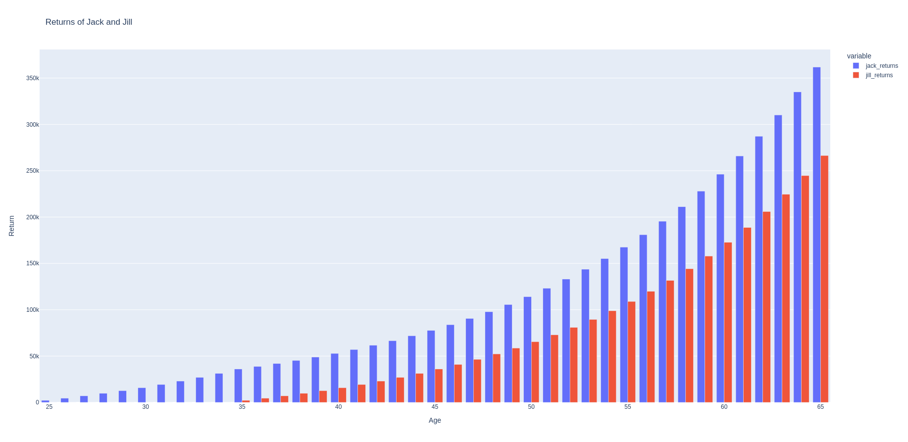
Here’s a chart of how their returns stack up -
| age | jack invests | jack_returns | jill_invests | jill_returns | jack_total_investment | jill_total_investment |
|---|---|---|---|---|---|---|
| 25 | 2000 | 2160 | 0 | 0 | 2000 | 0 |
| 26 | 2000 | 4492.8 | 0 | 0 | 4000 | 0 |
| 27 | 2000 | 7012.22 | 0 | 0 | 6000 | 0 |
| 28 | 2000 | 9733.2 | 0 | 0 | 8000 | 0 |
| 29 | 2000 | 12671.86 | 0 | 0 | 10000 | 0 |
| 30 | 2000 | 15845.61 | 0 | 0 | 12000 | 0 |
| 31 | 2000 | 19273.26 | 0 | 0 | 14000 | 0 |
| 32 | 2000 | 22975.12 | 0 | 0 | 16000 | 0 |
| 33 | 2000 | 26973.12 | 0 | 0 | 18000 | 0 |
| 34 | 2000 | 31290.97 | 0 | 0 | 20000 | 0 |
| 35 | 0 | 35954.25 | 2000 | 2160 | 20000 | 2000 |
| 36 | 0 | 38830.59 | 2000 | 4492.8 | 20000 | 4000 |
| 37 | 0 | 41937.04 | 2000 | 7012.22 | 20000 | 6000 |
| 38 | 0 | 45292 | 2000 | 9733.2 | 20000 | 8000 |
| 39 | 0 | 48915.36 | 2000 | 12671.86 | 20000 | 10000 |
| 40 | 0 | 52828.59 | 2000 | 15845.61 | 20000 | 12000 |
| 41 | 0 | 57054.88 | 2000 | 19273.26 | 20000 | 14000 |
| 42 | 0 | 61619.27 | 2000 | 22975.12 | 20000 | 16000 |
| 43 | 0 | 66548.81 | 2000 | 26973.12 | 20000 | 18000 |
| 44 | 0 | 71872.72 | 2000 | 31290.97 | 20000 | 20000 |
| 45 | 0 | 77622.54 | 2000 | 35954.25 | 20000 | 22000 |
| 46 | 0 | 83832.34 | 2000 | 40990.59 | 20000 | 24000 |
| 47 | 0 | 90538.93 | 2000 | 46429.84 | 20000 | 26000 |
| 48 | 0 | 97782.04 | 2000 | 52304.23 | 20000 | 28000 |
| 49 | 0 | 105604.6 | 2000 | 58648.57 | 20000 | 30000 |
| 50 | 0 | 114052.97 | 2000 | 65500.45 | 20000 | 32000 |
| 51 | 0 | 123177.21 | 2000 | 72900.49 | 20000 | 34000 |
| 52 | 0 | 133031.38 | 2000 | 80892.53 | 20000 | 36000 |
| 53 | 0 | 143673.9 | 2000 | 89523.93 | 20000 | 38000 |
| 54 | 0 | 155167.81 | 2000 | 98845.84 | 20000 | 40000 |
| 55 | 0 | 167581.23 | 2000 | 108913.51 | 20000 | 42000 |
| 56 | 0 | 180987.73 | 2000 | 119786.59 | 20000 | 44000 |
| 57 | 0 | 195466.75 | 2000 | 131529.52 | 20000 | 46000 |
| 58 | 0 | 211104.09 | 2000 | 144211.88 | 20000 | 48000 |
| 59 | 0 | 227992.42 | 2000 | 157908.83 | 20000 | 50000 |
| 60 | 0 | 246231.81 | 2000 | 172701.54 | 20000 | 52000 |
| 61 | 0 | 265930.35 | 2000 | 188677.66 | 20000 | 54000 |
| 62 | 0 | 287204.78 | 2000 | 205931.87 | 20000 | 56000 |
| 63 | 0 | 310181.16 | 2000 | 224566.42 | 20000 | 58000 |
| 64 | 0 | 334995.66 | 2000 | 244691.74 | 20000 | 60000 |
| 65 | 0 | 361795.31 | 2000 | 266427.07 | 20000 | 62000 |
Plotting these using Plotly we can see the power of compounding. The following figure shows how the total returns for Jack and Jill grows.

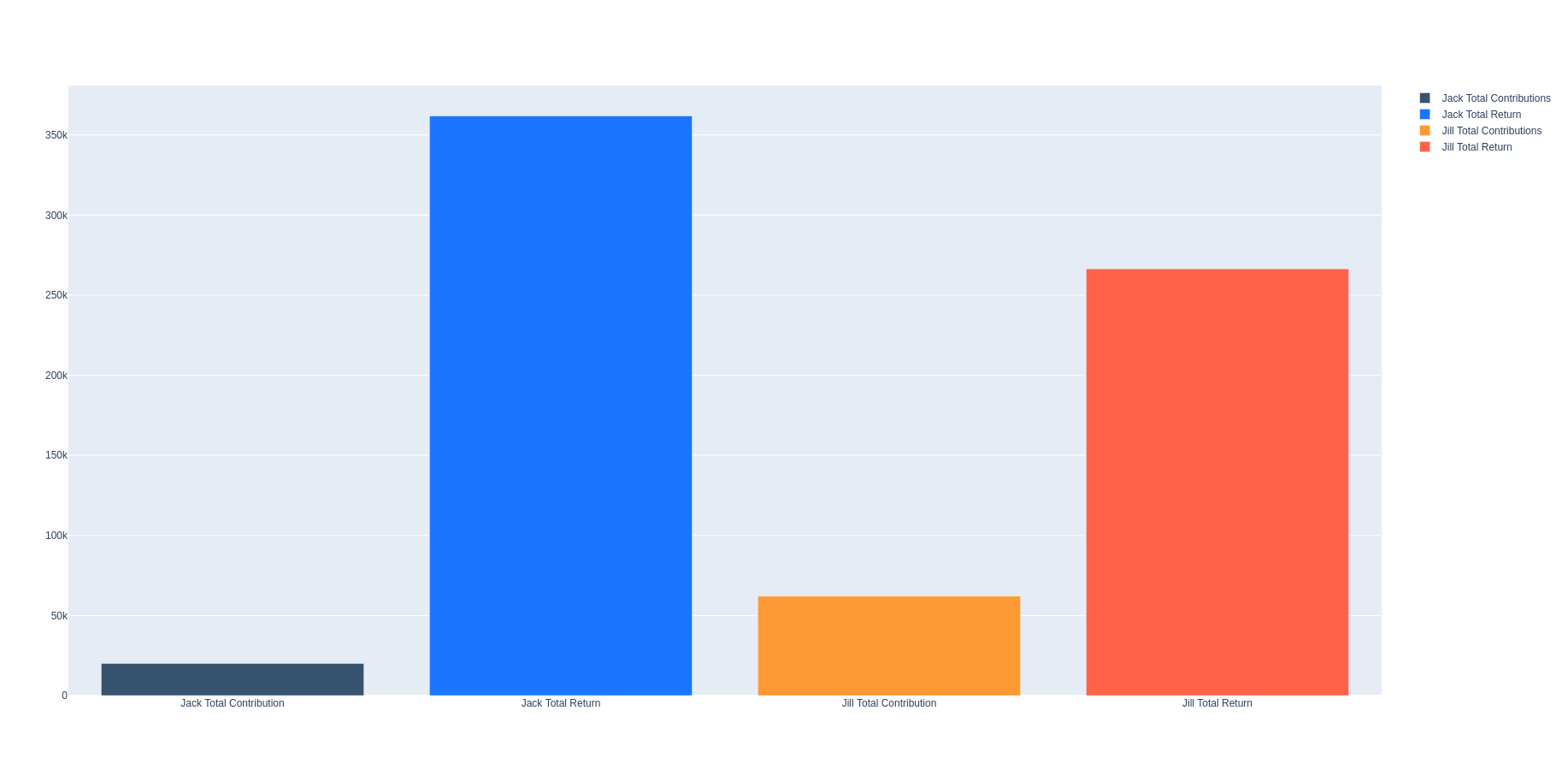
This following barplot show how their final returns stack up and their total contributions.

So here’s the power of compounding - Jack ends up with $361,795 with a net contribution of $20,000, while Jill ends up with a total of $266,427 with a net contribution of 62K! So just because Jack started contributing early he was able to grow his pile much more than Jill, who ended up contributing about $40K more than Jack!
Note that the scenario I present here does assume -
- an idealized and consistent return of 8%,
- investment into a broad stock index like a total stock market index
However, there are studies showing that invested in a broad market index yields greater than 6% if you stay invested over a long period.
Finally, this is the complete Python program I used to both generate the dataset, and to plot the results
import pandas as pd
import plotly.graph_objects as go
import plotly.express as px

if __name__ == "__main__":
    def returns(age_start: int, age_stop: int, s_age: int, early_investor: bool) -> list:
        initial_investment_age_stop = s_age
        annual_contribution = 2000
        annual_return_rate = 0.08

        # Initialize variables
        total_amount = 0
        returns_list = []

        # Loop through each year, simulating the investment growth
        for age in range(age_start, age_stop + 1):
            if early_investor:
                if age <= initial_investment_age_stop:
                    # Add principal for ages 19 to 27
                    total_amount += annual_contribution
            else:
                if age >= initial_investment_age_stop:
                    # Add principal for ages 28 to 64
                    total_amount += annual_contribution
            # Calculate the growth for the year
            total_amount *= (1 + annual_return_rate)
            # Add the total amount for the year to the list
            returns_list.append(total_amount)

        # Adjust the list to show the total amount at the end of each year, rounded to 2 decimal places
        returns_list = [round(amount, 2) for amount in returns_list]

        return returns_list

    # Create a dataframe according to the following:
    # 1. Create a datafrom with an age column from age 19 to 65
    # 2. Create column #2 called 'jack_invests' with value 2000 from age 19 to 27, and then 0 from age 28 to 64
    # 3. Create column #4 called 'jack_returns' with initial 2000 compounded at 6% from age 19 to 64, and also adding
    #   2000 from age 19 to 27
    # 4. Create column #3 called 'jill_invests' with value 0 from age 19 to 27, and then 2000 from age 28 to 64
    # 5. Create column #5 called 'jill_returns' with initial 2000 compounded at 8% from age 19 to 64, and also adding
    #   2000 from age 28 to 64
    start_age = 25
    end_age = 65
    s_age = 35
    df = pd.DataFrame({'age': range(start_age, end_age + 1),
                       'jack_invests': [2000 if age < s_age else 0 for age in range(start_age, end_age + 1)],
                       'jack_returns': returns(start_age, end_age, s_age, True),
                       'jill_invests': [0 if age < s_age else 2000 for age in range(start_age, end_age + 1)],
                       'jill_returns': returns(start_age, end_age, s_age, False)
                       })

    # Plot the returns of Jack and Jill using plotly as a bar plot
    fig = px.bar(df, x='age', y=['jack_returns', 'jill_returns'], title='Returns of Jack and Jill', barmode='group')
    fig.update_layout(xaxis_title='Age', yaxis_title='Return')
    fig.show()

    # Plot total investment of Jack and Jill using plotly. Also plot the total returns on investment as a percentage
    # of the total investment at age 65
    df['jack_total_investment'] = df['jack_invests'].cumsum()
    df['jill_total_investment'] = df['jill_invests'].cumsum()

    jack_total_investment = df['jack_total_investment'].iloc[-1]
    jill_total_investment = df['jill_total_investment'].iloc[-1]
    jack_final_return = df['jack_returns'].iloc[-1]
    jill_final_return = df['jill_returns'].iloc[-1]

    jack_total_return = (jack_final_return - jack_total_investment) / jack_total_investment * 100
    jill_total_return = (jill_final_return - jill_total_investment) / jill_total_investment * 100

    fig = go.Figure()
    fig.add_trace(go.Bar(x=['Jack Total Contribution'], y=[jack_total_investment], name='Jack Total Contributions', marker_color='rgb(55, 83, 109)'))
    fig.add_trace(go.Bar(x=['Jack Total Return'], y=[jack_final_return], name='Jack Total Return', marker_color='rgb(26, 118, 255)'))
    fig.add_trace(go.Bar(x=['Jill Total Contribution'], y=[jill_total_investment], name='Jill Total Contributions', marker_color='rgb(255, 153, 51)'))
    fig.add_trace(go.Bar(x=['Jill Total Return'], y=[jill_final_return], name='Jill Total Return', marker_color='rgb(255, 99, 71)'))
    fig.show()